Sunday 24 October 2010

Fashion, Art and Culture Final Artefact


My final artefact turned out a lot better than I had expected. I did not expect it to stand up alone and thought it would need to be hung up in exhibition, but I think I made the right choice on the scale of the metal shapes and the technique I used to attach them together, as this left less space between each shape, giving the bag support to stand alone, as if it were made from a sheet of metal, but also allowed it to have a slight slouch, like it would have had if it had been made from fabric.

I think it reflects more the theme of Paco Rabanne well, as the linking of metal (and plastic in his work) shapes was one of Rabanne’s signature techniques. I also think that there is a subtle hint to Trash Fashion and Throwaway Culture if you look closely to see that it is made from aluminium drinks cans.

 Final Artefact: Front View

Final Artefact: Side View

Final Artefact: Close-Up of Metal Shapes on Front (same on the back)

Final Artefact: Close-Up of Side Metal Shapes

Final Artefact: Close-Up of Front Top Corner (same on the back)

Sunday 17 October 2010

Fashion, Art and Culture Research and Ideas


One of my '1930s Hollywood' research sheets

My 'Trash Fashion and Throwaway Culture' research sheet

One of my 'Art Deco' research sheets

One of my 'Paco Rabanne' research sheets
Basically, after researching  Paco Rabanne, Art Deco and 1930s Hollywood (all of which I displayed on research sheets, which look a bit to much like moodboards and could have simply had images with quick annotations and maybe some sketches of ideas which would have saved me time) , my general theme is Paco Rabanne, simply because I admire the futuristic aspect of his work as well as his skill at using unconventional materials, but I also did some research into ‘Trash Fashion’ and Britain’s throwaway culture. I found that the throwaway culture is quite a big problem in the UK, more than it is in other parts of Europe:

  • ·         About 74% of unworn clothes are binned rather than donated to charity;
  • ·         Around 2 million shoes are thrown away each week;
  • ·         3-5% of the waste that is landfilled in the UK is textile;
  • ·         Clothes decompose very slowly, forming a leachate which contaminates water sources as well as producing methane;
  • ·         Synthetics take hundreds of years to decompose;
  • ·         Polyester is the main fabric of throwaway fashion, which is non-biodegradable and is usually blended with other fabrics, making it difficult to recycle.
(Lee,M. (2007) Eco Chic: The Savvy Shopper’s Guide to Ethical Fashion, London, Octopus Publishing Ltd.)
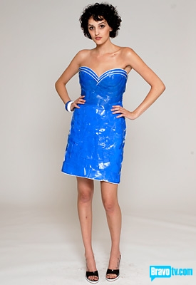
I then decided to research how designers all over the world are tackling the problem. I found a few ways designers have approached the issue: designer Donna Sgro designed a dress made from a fabric called ‘Morphotex’, which is based on the wings of the Morpho butterfly of the Amazon River. The fabric gets its colours from simply reflecting light (like the butterfly’s wings), allowing a full spectrum of colour without the use of chemical dyes or pigments. Another way of tackling the problem, which I liked the most, was to use products that we throw away to actually make the garments, rather than unconventional fabrics. I found this technique from looking a design from Season 5, Episode 1 Let’s Start from the Beginning, where the designers were challenged to make an outfit using things bought in a grocery store. Plastic cups and vacuum cleaner bags were some of the materials used. I also felt this technique would fit in with the theme of Paco Rabanne because he is a designer famous for using unconventional materials to construct his garments.
Donna Sgro- 'Morphotex' Dress, Source: http://inhabitat.com/2010/07/18/%E2%80%9Cmorphotex%E2%80%9D-dress-mimics-butterfly-wing-shimmer%E2%80%94without-dyes/
Plastic Cup Dress, Project Runway, Season 5, Episode 1: Let's Start from the Beginning, Source:http://www.oninteriordesign.com/on_interior_design/2008/10/top-design-and-project-runway.html
In my ideas, I sampled multiple materials that would be considered ‘throwaway’ materials, including newspaper, bin liner and aluminium cans. I then looked at a couple of techniques Rabanne used in his work, including linking metal and pleating. I also looked at other techniques, including ruffling, staining and burning to see their effect, but I felt that the linking of metal not only worked the best, but it also made it clear that Rabanne is my theme, so I am taking this forward into my final piece.
Idea Sheet: Metal and Origami

Idea Sheet: Pleating

Idea Sheet: Drinks Cans and Ring Pulls

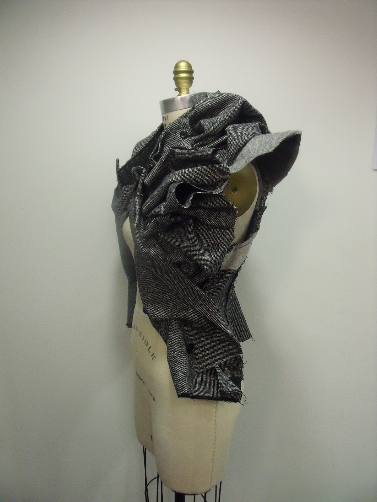
Ideas Sheet: Binliners and Burning
 After sampling this technique further, testing which way to link the metal and the scaling of the metal shapes, I have decided to scale the shapes down, so as to allow more detail in the artefact, and I am going to link them together diagonally rather than vertically and horizontally so that there are no large gaps between the pieces.
Ideas Sheet: Sampling linking alumimium shapes together with paper clips

Monday 4 October 2010

Art Nouveau and 'Make Do and Mend'

We were set two group tasks this week aimed to broaden our knowledge on a particular aspect of art and fashion. The first task on Tuesday was to research as a group a single aspect of art or fashion from our lectures. My group researched Art Nouveau. When we got this theme, I got it mixed up with Art Deco by accident and was a bit disappointed because I didn’t have a lot of knowledge on Art Nouveau. However, from doing research into the style for the group moodboard I discovered that it is mostly influenced by nature, using stylized flora patterns for borders in paintings, advertisements and on glass. One of the areas I like the most from the Art Nouveau style is the metalwork. I love how the metal, a strong, solid material, is curved into these amazing designs of plants, especially on stair banisters and balconies, where the designs are not only for aesthetic, but also for safety. These stylized designs could be interpreted into either a wearable fashion piece or a piece simply for show on the catwalk, with a mixture of embroidery and smooth, swirling designs coming out from the garment.
My group's moodboard- Art Nouveau

The second group task we were set on Wednesday was based around ‘Make Do and Mend’, for which we were all asked to bring in a vintage or retro accessory or garment. My group decided to uses an old man’s coat and turn it into a woman’s piece. We originally tried designing what we wanted to make on paper, but we realised, when we had a basic idea, that we could not tell exactly what the fabric would do when we tried to ruffle it, so we ended up experimenting on the mannequin, pinning it in to make it fitted and turning the sleeves into a ruffled collar. I think the tweed fabric worked really well because it was quite heavyweight due to the interfaced sections on the back which allowed it to be structured more than a thinner fabric. As the jacket was looking pretty plain colour wise, we decided to ado some colour using a tie that I’d brought down the back of the garment. We ruffled it in the same way we ruffled the front of the garment. The red and cream create a good contrast against the grey tweed. Im not that keen on the shoulder pad fabric as it is simply the basic felt that was used in the jacket, if we were to do this again, I would definatly cover these with either the same tweed or with another contrasting fabric. The felt is more apparent to the back than to the front, though, and at the front, the shoulders actually look attractive as they are.


We wanted to give the garment an unfinished look, so we used tacking thread in places to contrast the colour of the grey fabric, turned the jacket inside-out and removed the lining to reveal the back of the seams on the outside,  as well as leaving a raw edge on the hem to allow some fraying for aesthetic appeal. Come to think of it, this would have fitted in last season quite well as raw edges were in. I think the unsymmetrical effect created in the garments structural details give it a little more edge, and it looks like something that could be sold in a shop like All Saints. It is different yet it could be worn as smart piece. I personally do not like the tacking stitch around the collar, looking back at the photos, and I think that it would look a lot better either without or if the stitch had been done on machine because we hand stitch it. We tried styling the garment with a vintage brooch, which we ended up taking off because some of the group thought that it looked to Edwardian to go with our garment, I thought it looked good with the brooch as well as without because it added a bit of colour to the front, but I can see that it could draw the eye away from the garment as a whole.
My groups 'Make Do and Mend' jacket- Front View

Back View
Side View

Back Detail

Back Detail

Front Detail

With Brooch

Brooch Detail


Fashion, Art and Culture Brainstorm

Two Mondays ago, I was given the brief for the Fashion, Art and Culture module. It is entitled ‘Then is Now’, and basically I’ve got to research three different themes, the first of which was part of my summer project, for which I chose 1930s Hollywood, which I have collected a lot of imagery for from online and in books. The last two themes were to be chosen from one of our lectures on fashion history between 1850 and now. We then have to collate there research of our three themes and choose the strongest one to take forward into ideas sheets and on to the manufacture of an artefact, which could be a 3D canvas or a bag for exhibition. My second theme is Paco Rabanne and I haven’t chosen my third yet because I cannot decide, I like the idea of ‘Make Do and Mend’, but I also like Gareth Pugh’s more extravagant work, Thierry Mugler’s structural creations and Hussein Chalayan’s conceptual work, especially his plastic Bubble Dress worn by Lady Gaga. 

I already have an idea of what I could do with the Paco Rabanne theme. As he is famous for the use of unconventional materials, including metals, in his work to create metal disc dresses, I was thinking that I could use empty drinks cans to create my artefact. I could use the inside of the cans to get a reflective silver surface, or I could try using the front sides of the cans to convey a message of recycling as that is an important aspect of modern day society.

Nottingham

Gert and Uwe Tobias (Untitled), cover of the Nottingham Contemporary Exhibition Guide (17th July- 3rd October 2010)
My fashion group went to Nottingham on Thursday 14th September to research for our Fashion, Art and Culture, the first project of our BA (Hons) Fashion degree. I found the city to be a lot more about Robin Hood than I expected, as well as still having many of its Medieval aspects. One of the places I visited was Nottingham Castle, which was interesting because of the contrast between the older, perhaps original parts of castle and the new, renovated parts. I also particularly liked the moss growing on the walls of the castle, and manipulating fabric to try and replicate this effect would create and interesting aesthetic and texture.
Moss growing on a wall of Nottingham Castle, Photographed by myself, September 2010

Moss growing on a wall of Nottingham Castle, Photographed by myself, September 2010

I also visited Nottingham Contemporary, which had two exhibitions showing, but I was only allowed to take photos in one. The first exhibition, which I was allowed to photograph, displayed the work of Gert and Uwe Tobias, twin brothers from Romania. I wasn’t very inspired by some of the work on show, the large scale paintings just didn’t appeal to me and I don’t really understand them. However, I did like some of their ceramic work, the texture created by the porcelain, the mix between smooth, flowing and sharp, jagged, some of the ceramics also have a burned colour slip added to them.  To me, they look almost like clocked figures weeping, the tears interpreted from the sharper details. I also liked some of the drawings with black backgrounds. They looked dark and sinister, my favourite of which was of what appears to be jester with a red face and large collar. I thought it looked a bit like a character from a Japanese mange film and the mixture of medias (white pencil, paints and collage) give the image a bolder image.
Gert and Uwe Tobias Ceramic, Photographed by myself, Nottingham Contemporary September 2010

Gert and Uwe Tobias Ceramic, Photographed by myself, Nottingham Contemporary, September 2010
The second exhibition in the gallery displayed the work of photographer Diane Arbus. I did find some of her work interesting, for example, ’Tattooed Man at a Carnival, Md’ (1970). I like this photo because of the boldness in the tones, as well as the contrast of the sky to the landscape and to the figure. As I was leaving the gallery, I saw a large sun umbrella folded down in the outdoor seating area of a pub. I took a photo of it because I thought that the way it was folded made it look like a man wearing a hooded cape. Although this may not fit into my first project brief, I thought it may come in useful at some other point, perhaps as inspiration for a garment silhouette or even just the bold red colour of the fabric.
'Identical Twins' by Diane Arbus, Roselle, N.J. 1967, sourced from the Nottingham Contemporary booklet, 17th July- 3rd October 2010

'Tattooed Man at a Carnival Md' by Diane Arbus, 1970, sourced from the Nottingham Contemporary booklet

Umbrella, Photographed by me, Nottingham, September 2010
The final place I visited was the Galleries of Justice Museum, which wasn’t very inspirational, it was mainly exhibitions of Robin Hood, both the legend and the films, and another about crime and punishment history, which was mainly newspaper clippings and historical devices used to punish and execute criminals in the past, however, in retrospect, the newspapers could have been a useful source of inspiration. I collected a few leaflets from the Galleries one of which was an advertisement for a play called “Welcome to Stinxville”. The image on the advert looks quite sinister with bars and a man wearing black and blacked out glasses, with an air of fear, due to the mist over the image and the tagline “Can you find the courage to enter?” It also looks quite provocative, as all the females in the image are dressed in Victorian burlesque, suggesting that it is more of a sexual production.
Flyer advertising the play "Welcome to Stinxville" by Imogen Joyce, Presented by The Artful Goders Theatre Company, also advertising the Galleries of Justice Museum, 2010